This website was archived on July 21, 2019. It is frozen in time on that date.

Sonya Mann's active website is Sonya, Supposedly.

NEETBUX NATION 2020

I am releasing a handful of #YangGang designs into the public domain, using the license CC0 1.0 Universal. The art was originally intended for T-shirts, so the full-size files are large and high-resolution.

Because of the CC0 license, you can distribute the designs, edit them, remix them, use them in products, incorporate them into advertising… whatever you want. Attribution is not required, although it would be appreciated 😊

All of the third-party visual assets that I used were available with equivalent permissive licenses (on websites like Unsplash) or were created by me. (For example, I drew the portrait of Yang’s face.) My primary tool was Pixelmator, with a splash of PhotoMosh for flavor.

Full-size files, plus the Pixelmator versions, are available for download in a Dropbox folder. WordPress wouldn’t let me upload huge images, so the ones below are edited to be smaller.

"Secure the Bag" Andrew Yang 2020 #YangGang design, public domain
full size // Pixelmator file
"Neetbux Nation" Andrew Yang 2020 #YangGang design, public domain, variation 2
full size // Pixelmator file
"Neetbux Nation" Andrew Yang 2020 #YangGang design, public domain, variation 1
full size // Pixelmator file
"Neetbux Nation" Andrew Yang 2020 #YangGang design, public domain, variation 3
full size // Pixelmator file
"$1k Neetbux 2020" Andrew Yang #YangGang design, public domain, dark version
full size // Pixelmator file
"$1k Neetbux 2020" Andrew Yang #YangGang design, public domain, light version
full size // Pixelmator file

In case you’re wondering, I have no affiliation with presidential candidate Andrew Yang or his campaign. I don’t even support his agenda, which I consider to be woefully underspecified. The memes are what got me excited 😜

Granted, the other presidential wannabes don’t impress me either. It’s probably impossible to be a viable candidate while also living up to my standards. That said, I did donate like $5 to help Andrew Yang qualify for the primary debates, and I attended a rally that he held in San Francisco.

Behavior Design: Teaching Your Users Security

I presented this talk at CodeConf LA in June, 2016. The full slides are available on their own as a PDF, but the most relevant ones are included in the post below.


Hi, my name is Sonya Mann. I’m a tech enthusiast, freelance word person, and user of many websites, apps, and software products. This talk is aimed at people who make websites, apps, and software products. It’s about how you can nudge your users toward better security habits.

Forewarning: I’m going to use passwords as an example quite a bit, because they’re the most common security credential that regular users handle and control, but this way of thinking about things is not limited to passwords. Now let’s dive right in!
Behavior Design: Teaching Your Users Security

You may already know this, but typical users have bad security habits. It’s not because they’re stupid or lazy, but because they have different priorities. Most people aren’t judged at work or in their personal life by their password hygiene. And if they haven’t personally experienced an account takeover or identity theft, they’re not on high alert.

If you’re a quote-unquote “normal person” — sometimes we call them “non-technical people” or “people who aren’t paranoid hackers” — if you’re that kind of person, strong security habits don’t necessarily feel like they’re worth the hassle. Just in case you don’t believe me, I want to show you some stats.
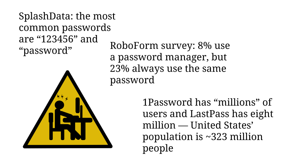
password habits and password manager usage stats

SplashData is a password manager company that conducts an annual analysis of commonly used passwords. For the past five years straight the most popular passwords have been the number string “123456” and the word “password”. I find it disturbing that any application allows users to choose either of those values as their password!

In the same vein, last year RoboForm, another password manager company, commissioned a survey of 1,000 people in the US and UK about their password practices. Only 8% of respondents said they used a password manager. Compare that to the 23% who said they always use the same password.

Furthermore, I contacted the makers of the two most popular password managers, 1Password and LastPass. The 1Password team said they have unspecified millions of users, and LastPass’ spokesperson told me that they have eight million users. So let’s guesstimate, generously, that twenty million people use password managers. That would only be 6% of America’s 2014 population — and the world is a lot bigger than America. So there is plenty of room for improvement here. Especially since passwords are only the most obvious credential!

One of the most visible types of problems that people’s poor security habits cause is the account takeover. If you’ve ever worked support, you’ve probably had to deal with these. Mistakes that lead to these issues are not limited to the “normal people” I mentioned in the beginning.

Continue reading “Behavior Design: Teaching Your Users Security”

Critiquing Twitter’s New Followers Notification

I’m joining the grand tradition of ragging on Twitter for its weird and bad design choices! Let’s zoom in on a particular feature that I dislike. Here’s a notification that Twitter presents to me every day, from which I derive zero delight:

People who recently followed me on Twitter. If I clicked into the details here, I would find that 90% of these people use spammy hashtags in their profiles.
Brett Shavers is legit, but 90% of these people use spammy hashtags in their profiles.

It is good that Twitter collapses distinct follow events into one notification. Unfortunately, I still feel negative about the experience. Being followed on social media has the potential to generate joy — hooray, people are paying attention to me! — but the reality is closer to getting an unsolicited sales call.

What if Twitter defaulted to not notifying me of new followers? That would keep my focus on conversations — where my focus naturally wants to be anyway — instead of urging me to grind my user stats upward. There’s no reason why Twitter must deliver a notification when someone follows you. What if you had to manually look at your list of followers to check on this? People would still do it, of course, but it wouldn’t be a behavior encouraged by the platform’s design.

Vintage spam. Photo by GM.

Getting rid of the “people followed you!” notification might also cut down on the amount of #marketing and bot accounts that insta-follow me based on keywords in my tweets. From their perspective, the utility of following me would be lessened because Twitter’s design wouldn’t assist them in shoving their messages in front of my eyeballs. On the other hand, the change might encourage those accounts to proactively tweet at me, which would be horrible. I think it’s at least worth A/B testing to see what the actual behavior is.

Of course, changing this notification feature would be treating the symptom rather than the sickness. Well… sometimes you gotta do that. Eliminating the problem altogether would involve fundamentally changing how Twitter works, which I don’t want. Public broadcast systems naturally attract spam, but you can mitigate the effect on genuine users.

Design as an Attitude

The design process consists of making conscious decisions about how to set up a creation. Design’s defining ethos is thinking deeply about a system before planning to implement it. Even a simple object can be considered a system, or perhaps an interface, because it will be touched and used. Therefore even the most basic product should be designed in the way I’m describing. Something complex like a computer operating system requires extensive mental energy.

Free menu icons by The Open Dept.
Free menu icons by The Open Dept. Pretty generic.

One of my least favorite aspects of the world — of reality — is that you can’t simply intuit things. The human brain is frequently irrational and instincts are often wrong, so we need evidence and research to guide us. Humans were able to invent algebra but we certainly don’t follow the rules of logic in our day-to-day mental processing — hence Wikipedia’s long list of cognitive biases.

Design is how we combat our mental quirks when building a product. Instead of throwing things together willy-nilly, we try different combinations, test the results, and eventually settle on a functional configuration. Hopefully the best option is also beautiful! This method produces better results than following random impulses and calling it good.

Theoretically, anyway — sometimes I’m baffled by the choices of very high-status manufacturers.

Wanna use Apple's Magic Mouse while charging it? TOO DAMN BAD. Photo by Roman Loyola; via Macworld.
Wanna use Apple’s Magic Mouse while charging it? TOO DAMN BAD. Photo by Roman Loyola via Macworld.

Iterative Personal Development

Currently I am slightly obsessed with the concept of iteration. (That was the intent behind my “communicational pliancy” post.) When people talk about iteration in terms of software development — which is the context that I’m familiar with — they mean gradual improvement, tweaking and changing things after “shipping the minimum viable product”.

I want to live my life along the same lines: trying things, gathering information about how well they worked, and then trying something else. Built into this approach is room to experiment, even to fail.

Evolution by Kevin Dooley, made with Ultra Fractal software.

I was talking with a new friend recently about designing systems, especially systems meant to organize people. I cited one of my takeaways from The Design of Everyday Things: you have to expect people to try the “wrong” thing, to misunderstand how the design is supposed to work. People will press every button in every bizarre combination and you have to plan for that. Systems (of all kinds) have to be designed to accommodate failure — if they aren’t, they will eventually self-catastrophize, to coin a phrase. (Just give Zappos a year or two.)

If you squint, this principle applies to one-person systems also. For optimal productivity and happiness, I have to design my own habits and attitudes to accommodate the quirks of human nature, my own specific personality, and the inevitable ill-advised impulse. Iteration seems like a great framework for this, since it’s all about incremental change that leads to gradual improvement.

Sign up for my newsletter to stay abreast of my new writing and projects.

I am a member of the Amazon Associates program. If you click on an Amazon link from this site and subsequently buy something, I may receive a small commission (at no cost to you).