I presented this talk at CodeConf LA in June, 2016. The full slides are available on their own as a PDF, but the most relevant ones are included in the post below.
Hi, my name is Sonya Mann. I’m a tech enthusiast, freelance word person, and user of many websites, apps, and software products. This talk is aimed at people who make websites, apps, and software products. It’s about how you can nudge your users toward better security habits.
Forewarning: I’m going to use passwords as an example quite a bit, because they’re the most common security credential that regular users handle and control, but this way of thinking about things is not limited to passwords. Now let’s dive right in!
You may already know this, but typical users have bad security habits. It’s not because they’re stupid or lazy, but because they have different priorities. Most people aren’t judged at work or in their personal life by their password hygiene. And if they haven’t personally experienced an account takeover or identity theft, they’re not on high alert.
If you’re a quote-unquote “normal person” — sometimes we call them “non-technical people” or “people who aren’t paranoid hackers” — if you’re that kind of person, strong security habits don’t necessarily feel like they’re worth the hassle. Just in case you don’t believe me, I want to show you some stats.
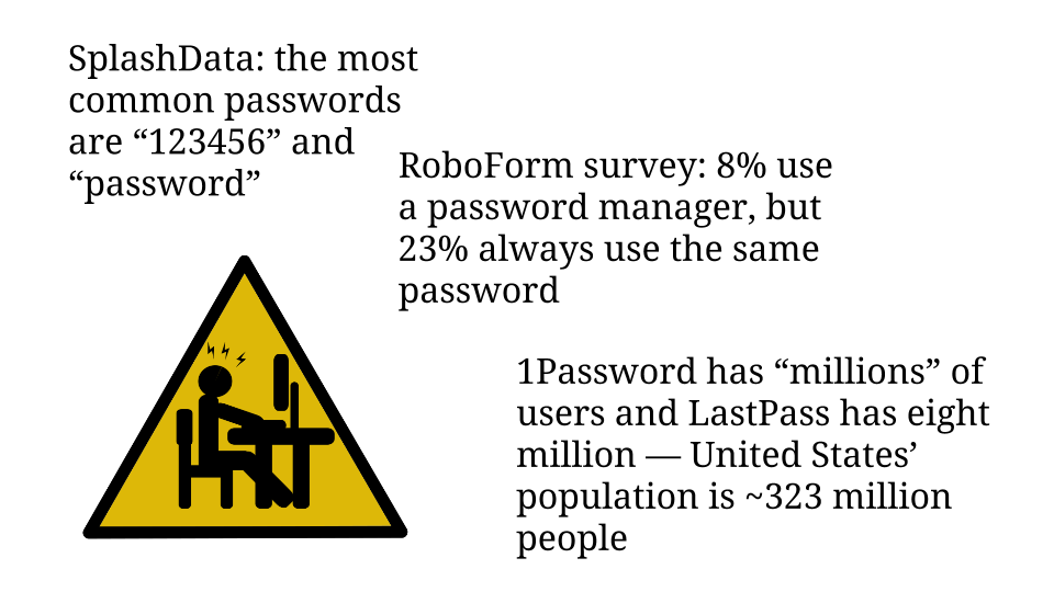
SplashData is a password manager company that conducts an annual analysis of commonly used passwords. For the past five years straight the most popular passwords have been the number string “123456” and the word “password”. I find it disturbing that any application allows users to choose either of those values as their password!
In the same vein, last year RoboForm, another password manager company, commissioned a survey of 1,000 people in the US and UK about their password practices. Only 8% of respondents said they used a password manager. Compare that to the 23% who said they always use the same password.
Furthermore, I contacted the makers of the two most popular password managers, 1Password and LastPass. The 1Password team said they have unspecified millions of users, and LastPass’ spokesperson told me that they have eight million users. So let’s guesstimate, generously, that twenty million people use password managers. That would only be 6% of America’s 2014 population — and the world is a lot bigger than America. So there is plenty of room for improvement here. Especially since passwords are only the most obvious credential!
One of the most visible types of problems that people’s poor security habits cause is the account takeover. If you’ve ever worked support, you’ve probably had to deal with these. Mistakes that lead to these issues are not limited to the “normal people” I mentioned in the beginning.
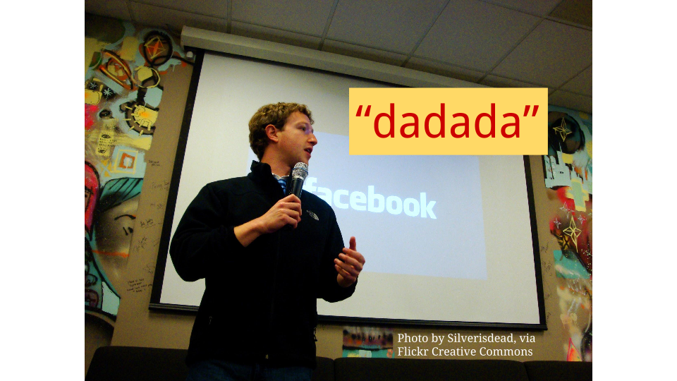
Mark Zuckerberg is widely acknowledged to be a genius — even if you don’t like Facebook as a product, you can probably admit that he’s a brilliant CEO. Zuck is a very smart person, high-profile, rich, and we can assume he’s more tech-savvy than the average user. Mark Zuckerberg is the type of person a bad actor might target, but also the type of person who should have good protection against basic attacks. However, recent headlines showed us that Mark Zuckerberg used the password “dadada” on at least three different social media accounts: LinkedIn, Twitter, and Pinterest.
We know that because after the LinkedIn breach, Zuckerberg’s other two accounts were hacked. Pretty embarrassing. Imagine the frustration for Twitter and Pinterest, and every other company that had to deal with account takeovers because of the LinkedIn breach. They haven’t done anything wrong, and luckily they’re not dealing with the PR firestorm that LinkedIn is. But people used their LinkedIn credentials on multiple platforms, causing problems for everyone.
Someone who reused their LinkedIn password might require support work from Twitter, Pinterest, banks, PayPal, and various other companies. Support teams are expensive, and every time a customer has to interact with your support system it’s a tax on their goodwill, even if the issue wasn’t your fault. The more you can limit the need for this, the better.
True, Mark Zuckerberg’s situation might not have happened if the LinkedIn passwords had been protected better in the first place. So let me give you an example that’s pure user error. Verizon did a study in 2015 which showed that 23% of people who receive phishing emails open them, and 11% open attachments. That’s a lot of people!
Or here’s another example, which I’m a little embarrassed to admit — whenever I turn on two-factor authentication and the website tells me to write down backup codes, I either just take a screenshot or take a picture with my phone. I shouldn’t do this. And yet I do, because it’s the path of least resistance, and no one scolds me not to.
I want to share a quote from “The Basics of Web Application Security” by Cade Cairns and Daniel Somerfield:
“The first time someone signs up for your site of captioned cat pictures using the same email address and password that they use for their bank login, your seemingly low-risk credentials database has become a vehicle for storing financial credentials.”
So how do you deal with this general problem, of users not understanding how to take their own security seriously, or not caring enough to try? Technical work is the first, best, and most effective way to set ground rules. I’ll just throw out some basics: Use HTTPS everywhere. Hash and salt passwords. Find cross-site scripting opportunities and eliminate them. Enable multiple account management, especially if your software or web application has any kind of business application, since that limits the need to share passwords.
That said, technical security design is not the subject of this talk, so let’s assume you’ve set up your system safely.
Next you need to think about behavior design. That term basically means what it sounds like, but I believe in explaining jargon. Behavior design has a lot in common with user experience design, but instead of focusing on how the user feels, behavior design focuses on guiding the user toward certain actions. Really, it’s a nicer way to talk about manipulation.
Anyone who has shipped a product, whether it’s open source or proprietary, and then dealt with users’ reactions, knows how frustratingly impossible it can be to get the users to do what you want them to do. It takes a careful balance of limiting the options that are available, making sure the right options are available, and incentivizing the desired behavior.
Behavior design might involve instructions, or it might involve the graphical user interface — it depends on the actions you’re trying to encourage and the technology that you’re building. Really, this is more of a mindset than its own separate discipline. For the most part there aren’t any best practices outside of certain kinds of marketing.

I do want to mention that behavior design is often paired with technical work. It’s not something that happens in isolation — this is a multi-team effort. For example, have you ever set up an account and faced a list of password rules? Must contain a capital letter, a number, an asterisk, and three money signs? There’s the written explanation, which is integrated into the website design, and then the box you type in, and then the indicator saying whether what you typed is okay or not. It would be silly for all that to be set up if the underlying system still let you choose a password without three money signs in it. The user-facing stuff needs to talk to the code behind the scenes in order to be meaningful.
A group of people who are really good at this kind of manipulation is sleazy marketers. Or at least they do it the most obviously. I’m not saying that all marketing is sleazy, but certain techniques are pretty obnoxious. You know those popups that try to make you feel bad about closing them?
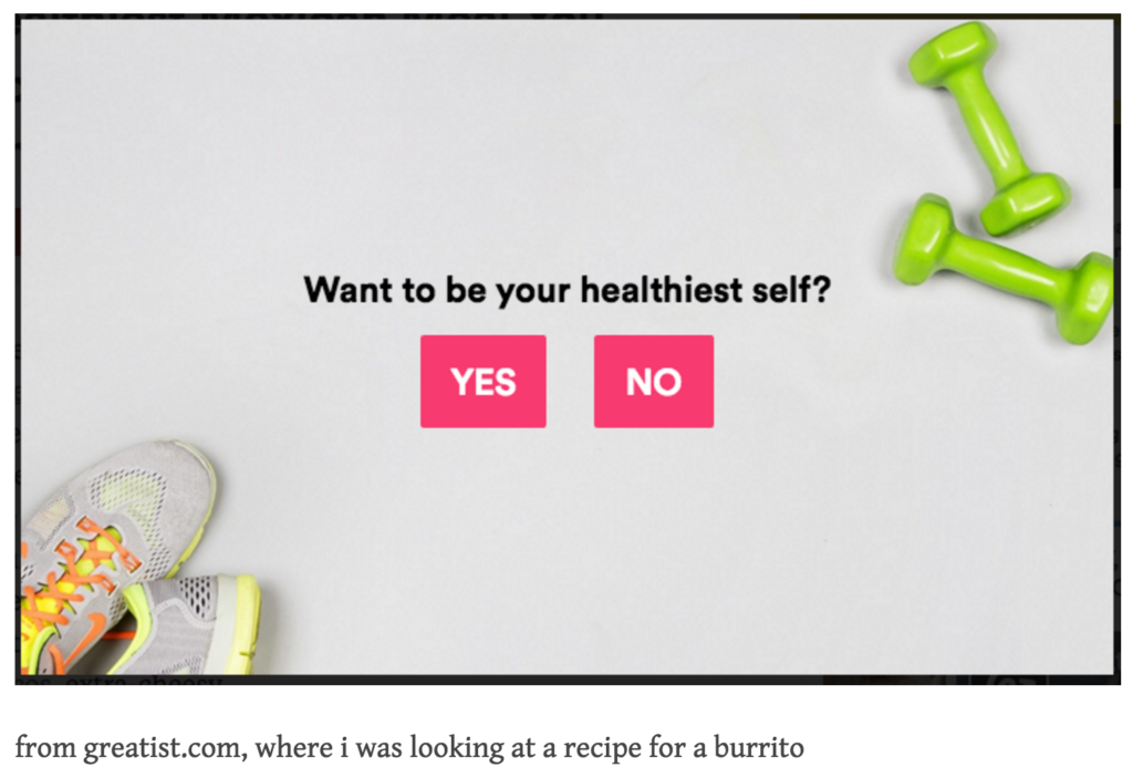
This popup from Greatist.com forces you to say that you don’t want to be your healthiest self in order to close it. That’s behavior design. I got the example from confirmshaming.tumblr.com.
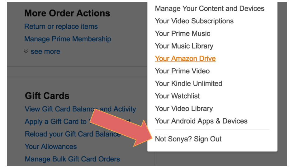
Similarly weird is Amazon making you claim that you’re not yourself if you want to log out.
Here’s another example. I don’t have a screenshot, so you’ll have to use your imagination. When you sign up for a Stripe account, they encourage you to turn on two-factor authentication. And then every other time you visit the Stripe dashboard, that yellow banner asking you to enable 2FA is still there, on top of everything else, pressuring you to secure your account.
It’s a visual distraction. Stripe forces you to think about 2FA every time you use the website until you turn it on. This is a behavior design technique that I like to call “irritating the user until they do what you want”. It’s not effective on everyone, but it works often enough to be worth the effort.

For contrast, let’s look at what not to do. ThoughtWorks developer Sam Newman blogged about a security flaw in a plugin for Visual Studio Code, which is an open-source code editor. He gave me permission to use his screenshots and his example. Sam was trying out Visual Studio Code, and he realized that it didn’t have a built-in spell-checker. He decided to look for an extension through their quasi-marketplace platform.
I have mixed feelings about this design. On the one hand, the README and LICENSE buttons are more prominent than the “download from the cloud right now” button. But you can download without doing any due diligence. Currently, once you click that cloud button, the extension downloads automatically. Which makes this a big problem:

As Sam Newman points out in his blog post, anyone editing private code should not be using a spell-checker that sends data via HTTP. That is totally insecure. If you’re working for a company like GitHub, to use our host as an example, the business has a lot of sensitive data and a lot of users. Exposing code that may be used in production can cause all kinds of problems.
The pushback on this concern is that people should be responsible for their own security, and that Visual Studio Code shouldn’t worry about naive users. There’s a legitimate argument to be made that everyone is responsible for proactively vetting any extension that they choose to install.
On the other hand, they’re not going to. It’s just not going to happen. Some people may even assume that plugins presented through this interface have been approved by Visual Studio Code. Many users won’t even consider the issue consciously.
The interface could pop up a disclaimer after you click, instead of downloading instantly. It could say something like this:
“Are you sure you want to download now? Remember, extensions have access to your data. If you’re handling sensitive information, it’s a good idea to look at the README and license first.”
In fact, a lot of behavior design is just telling people stuff. Conveying information with words. In other domains this is called copywriting, an art that is sometimes neglected in product design. Copywriting usually lives with marketing. It’s misguided to silo these two skills. Including copywriting in the user interface is like leaving comments in your code to explain what you’re doing.
Like I said earlier, marketing is full of behavior design, and it’s not all shady stuff like those popups. Maybe you’ve heard the phrase “benefits not features”.

The idea behind “benefits not features” is that instead of pitching people on the mechanism of your product, you should explain how it will improve their life. For example, Google’s tagline wouldn’t be “enter text into a search bar and get results”. Even “all the internet’s information at your fingertips” doesn’t quite get to the core. That’s better, but it’s still describing what the product does instead of why you should use it. Google’s real value proposition is something like “know the answer before your friends”. You want to appeal to people’s unsatisfied needs and leverage human nature.
This plays into security-focused behavior design. You can explain security benefits instead of security features. Instead of saying, “The password requirement is XYZ,” say, “Longer passwords protect your sensitive information, so we require at least at least 12 characters.” But that’s still pretty lackluster, since it’s generic. Maybe you’re working with customer relationship management software. Your pitch to get users to turn on two-factor authentication is not just “protect your account,” it’s “keep your customer data out of everyone else’s hands.”
In fact, behavior design doesn’t always have to be situated on the user interface itself. You will have lots of opportunities to communicate with your users. You can send lifecycle emails that educate users and point them to next steps. You should maintain a robust help center and prompt users to check it out when they seem to be having issues. Create tutorials about best security practices and why they’re worth the effort. You can link to these resources from the UI in appropriate spots.
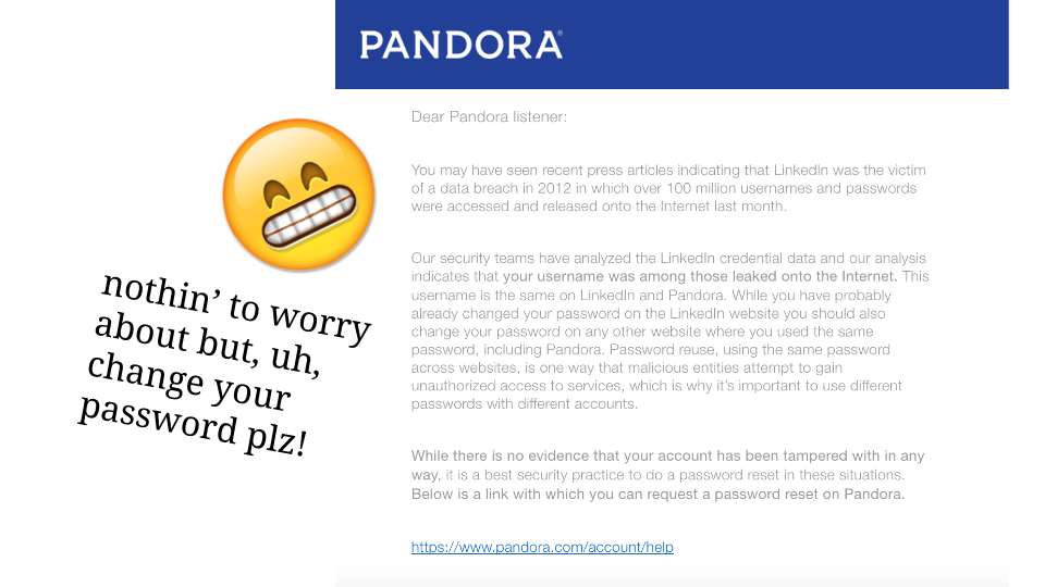
Here’s an example of behavior design beyond the UI — Pandora sent this email to my dad in response to the LinkedIn breach, explaining that his username was found in the leaked data.

So, I mentioned in the beginning that I would talk a lot about passwords. Now that I’m almost done, passwords are also a great example of the tradeoffs that come with security. Usually good security habits are inconvenient. That’s why they work — they provide friction. But if you’re a startup trying to grow 300% every week, adding friction to the signup process is the last thing you want. This is less of a problem for open source projects, but even software that isn’t necessarily earning money thrives on user adoption.
It is a legitimate business decision to streamline onboarding or any other important application process at the expense of encouraging the user to protect themselves. The business case for security-focused behavior design is that it reduces your PR problems down the road — I mean public relations, not pull requests, although maybe that too. However, that tradeoff might not be attractive, depending on your situation. I encourage you to A/B test everything you can and see how your actual users respond. You know your business and your product better than I do.
But… if you can spare the time and resources to incorporate more security-focused behavior design into your product or service, I encourage you to try. Users probably won’t thank you for it, but you can feel good about helping them take care of themselves.
Thanks, that’s all!
By the way… I’m available for consulting and such. Hit up me@sonyaellenmann.com and we can discuss the possibilities!