This website was archived on July 21, 2019. It is frozen in time on that date.

Sonya Mann's active website is Sonya, Supposedly.

PR Advice for Startups From an Actual Reporter

“How I got press coverage for my dinky seed-stage startup” is a common topic in places like /r/Entrepreneur, but it’s pretty rare for a journalist’s perspective to be included. Well, I’m a full-time tech reporter who’s been following and writing about the industry for several years. I don’t claim to be a veteran, but I certainly receive a lot of pitches from or about startups. I would appreciate it if the caliber of those pitches improved!

(I also owe a hat-tip to Sean Byrnes; last week he asked me how I decide which emails to pay attention to and which companies to cover. That’s why this subject is top-of-mind.)

Before we get into the suggestions, one caveat: Unless you have a Trumpian sixth sense for publicity, you will probably get farther by following my advice than you will by following your instincts. However, that doesn’t mean that my preferences generalize to literally all reporters.

Optimal Attitude

You’re not heading into a fair contest.

For one thing, the supply-demand dynamics are against you. Tech journos are inundated with pitches on a daily basis, and we only have so much time. That’s why you should adjust your approach to make our lives more convenient, whereas we can delete three times as many emails as we respond to.

For another thing, reporters are strongly biased in favor of companies or founders that our readers already know about. Especially at general-interest publications. “Popular Entrepreneur Does Thing” will usually generate more reader excitement than “Unknown Entrepreneur Does Thing” and journalists are keenly aware of that. Companies like Google or Facebook could be terrible at PR and they’d still get covered nonstop, because readers love hearing about them.

I’m sure it’s frustrating, but that’s just how the incentives work out. You’ll have a better time if you accept the unfairness and tailor your approach to giving your company the best chance possible.

Necessary Elements

Emails that don’t satisfy these requirements are wayyy more likely to be trashed immediately.

Within the first few sentences, say who you are and what your relationship is to the company. If you’re the founder, I want to know that. If you’re the head of comms, I want to know that. Etc, etc.

Explain the company’s purpose — what it does and what the product is. Be concrete and use plain English! Cliché or baffling jargon is an immediate turnoff. (This step isn’t necessary if your company is well-known, but if that’s the case, why are you even reading this post?)

Don’t pretend that you closely follow my coverage of blah blah blah, unless it’s actually true. Acceptable: “Since you wrote about [whatever topic], I think you might also be interested in covering [similar topic].” Annoying: “I really enjoyed your article about [whatever topic], and [insincere flattery].” C’mon — I am skeptical for a living.

That said, please do look at what I’ve written about before, and don’t pitch me if your company is not even remotely on my beat! It’s a waste of everyone’s time. The automated “spray and pray” approach to PR can work when executed well, but only if you manage to reach journalists who write about your subsegment of the industry.

Sparking Interest

Beyond the basic email etiquette outlined above, here are the criteria I use to evaluate whether a startup is worth more attention:

Does the product sound like it’s useful, and does the company have a business model? Yes on both counts = you pass this round. Yes on product = maybe. No to both = do not pass Go; do not collect $200.

Did the company actually do something? “Hey, my startup exists” is far less compelling than a genuine event. If you want to be in the news, do something newsworthy! Examples:

  • raising money
  • launching a product
  • changing strategy or pivoting
  • hiring a notable person

Side projects and internal initiatives can also qualify.

Will the company share metrics? Revenue is the best one, but hardly anyone discloses that. DAUs, MAUs, number of paid seats or licenses, MRR, burn rate — going on the record with financial details of any kind automatically makes you more interesting to me. Especially if the figure hasn’t been reported before!

Is there external validation? VCs can serve this purpose, as can advisors or notable customers. If Elon Musk called the founder a brilliant person, you will have an easier time getting covered.

6/15/2017 Update

I got the following text from a PR person who introduced me to a relatively early-stage startup:

I’m wrapping up the freelance gig with [company] and wanted to re-engage before I do and see if you wanted to revive this. Any feedback is helpful to them, too. What they’re doing is unique but I honestly struggled to get their name out there.

I responded:

Hey! So, in this case I wanted to write about the company or do a video but didn’t have buy-in from my editors for a dedicated piece.

Also, PR operates on long time-cycles. (You can tell them I said so.) it wouldn’t be surprising if I have a reason to mention [company] in the future. Knowing about the company and how it works means I have someone to tap if I’m going to write about [industry], for example

I probably didn’t do a good enough job distinguishing my enthusiasm about the idea from a guarantee of coverage — I can’t really ever guarantee that, and I’m trying to be more proactive about saying so

Tl;dr you did a fine job, but the stars didn’t align on my end

Hopefully that exchange adds some context about how this works in practice.


That’s it! Let me know if you have any questions. I’m smann@inc.com, me@sonyaellenmann.com (checked much less frequently), and @sonyaellenmann on Twitter.
All About Them Contexts

I don’t usually post links that I tweeted verbatim, and I also usually try to link to longer pieces rather than shorter ones, but I love this passage (from a Johanna Drott essayette) so much:

“Rational thinking takes the situation as it is and uses it as a basis for further action, and the situation is that human beings think in terms of contexts and relations rather than singular statements presented in isolation.”

Behavior Design: Teaching Your Users Security

I presented this talk at CodeConf LA in June, 2016. The full slides are available on their own as a PDF, but the most relevant ones are included in the post below.


Hi, my name is Sonya Mann. I’m a tech enthusiast, freelance word person, and user of many websites, apps, and software products. This talk is aimed at people who make websites, apps, and software products. It’s about how you can nudge your users toward better security habits.

Forewarning: I’m going to use passwords as an example quite a bit, because they’re the most common security credential that regular users handle and control, but this way of thinking about things is not limited to passwords. Now let’s dive right in!

Behavior Design: Teaching Your Users Security

You may already know this, but typical users have bad security habits. It’s not because they’re stupid or lazy, but because they have different priorities. Most people aren’t judged at work or in their personal life by their password hygiene. And if they haven’t personally experienced an account takeover or identity theft, they’re not on high alert.

If you’re a quote-unquote “normal person” — sometimes we call them “non-technical people” or “people who aren’t paranoid hackers” — if you’re that kind of person, strong security habits don’t necessarily feel like they’re worth the hassle. Just in case you don’t believe me, I want to show you some stats.

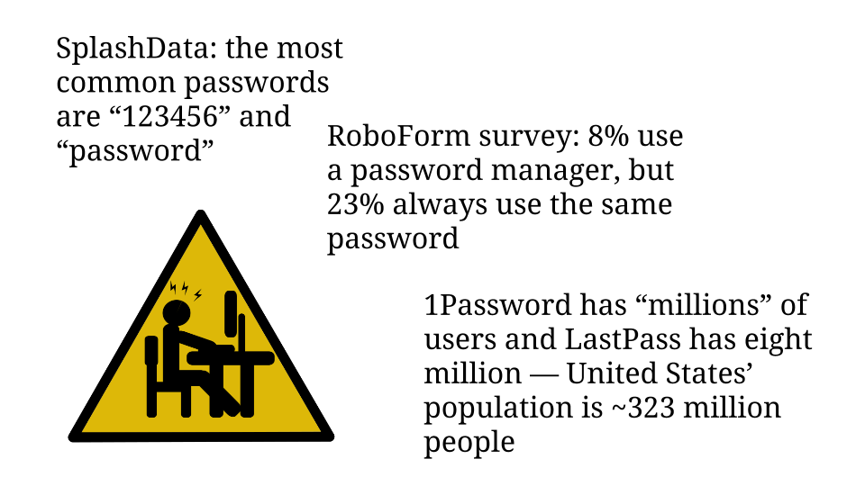
password habits and password manager usage stats

SplashData is a password manager company that conducts an annual analysis of commonly used passwords. For the past five years straight the most popular passwords have been the number string “123456” and the word “password”. I find it disturbing that any application allows users to choose either of those values as their password!

In the same vein, last year RoboForm, another password manager company, commissioned a survey of 1,000 people in the US and UK about their password practices. Only 8% of respondents said they used a password manager. Compare that to the 23% who said they always use the same password.

Furthermore, I contacted the makers of the two most popular password managers, 1Password and LastPass. The 1Password team said they have unspecified millions of users, and LastPass’ spokesperson told me that they have eight million users. So let’s guesstimate, generously, that twenty million people use password managers. That would only be 6% of America’s 2014 population — and the world is a lot bigger than America. So there is plenty of room for improvement here. Especially since passwords are only the most obvious credential!

One of the most visible types of problems that people’s poor security habits cause is the account takeover. If you’ve ever worked support, you’ve probably had to deal with these. Mistakes that lead to these issues are not limited to the “normal people” I mentioned in the beginning.

Continue reading “Behavior Design: Teaching Your Users Security”

Tips for Having Positive Interactions Online

I enjoy conversing with random netizens about the topics that interest me — power dynamics, ethics, etc. Unfortunately, seeking out productive discourse is an activity fraught with peril, since every second person online is MAD about whatever issue preoccupies them. (I don’t object to the anger, but I often object to how it’s expressed.)

I’m not an expert at avoiding pointless arguments full of hostility, but I’ve developed some useful heuristics. They started as coping mechanisms inspired by political flamewars on Facebook. I’ll give you the tl;dr first:

Above all else, be kind.

I love these dorky yellow humanoids. Image by Kate Ter Haar.
  1. Assume that people are speaking in good faith until they demonstrate otherwise beyond a reasonable doubt.
    • Train yourself to choose the friendliest interpretation of someone’s statement. I’ve found that expecting the best from people has a much better failure state than the alternative.
    • Ask lots of questions about what people mean. It’s easy for someone’s comment to be confusing or misleading by accident.
    • Reign in your snark; amp up your earnestness.
  2. Different people have different communication modes.
    • On the internet you will bump into many people who don’t share your cultural assumptions — and remember, culture is not just an ethnic thing — or who naturally have different defaults. Keep an eye out for this.
    • When someone’s interjection seems socially insensitive or rude, remember that their version of normal may be very different from yours.
  3. It’s fine to disengage if the conversation is distressing.
    • Remember the golden rule of self-care! Like they tell you on the airplane, secure your own oxygen mask before assisting anyone else. Prioritize your mental health and wellbeing — burnout helps no one.
    • Being upset is okay. It’s one of the many natural reactions to conflict that humans can experience. Anyone who says “it’s just the internet” or something along those lines is trying to minimize your feelings.

Obviously I am not 100% perfect at any of this — I’m a jerk online way too often — but I’m striving to communicate with people respectfully. Keeping these heuristics in mind helps me do that.

I may or may not update this list if more tips occur to me. Let me know in the comments or on social media (Twitter + Facebook) if you have feedback! Suggested additions are also welcome.

How To Describe Your Product On Your Landing Page

Think about copywriting as a type of design. The goal of design is to make things usable and delightful, right? Words can jump-start the process. Effective copy explains the point of your product to people who haven’t tried it yet. Clear descriptions and calls to action can prompt readers to purchase your product, download it, set up an account, or [insert desired action here].

Thousands of people make products that they want other people to try. A small but meaningful subset offers something useful, something worth people’s time or money. My guess is that the majority of entrepreneurs who’ve built a useful product get stuck at that stage, because they don’t communicate what it does or how it will solve people’s problems. Product-market fit is meaningless if you can’t convince the market to pay attention!

(Throughout this article I’m going to use “product” as a blanket term for “thing or service that you’re selling or trying to convince people to use”. Fill in your own blank. “Landing page” should also be interpreted expansively — it might be your website, your App Store listing, or even a Google search result.)

Here are the three essential components of a new or unknown company’s landing page:

  1. Concrete explanation of what your product or service is. Don’t be afraid to be literal.
  2. Value proposition, AKA why potential users should be interested.
  3. Call to action, ideally a form that can be filled out without navigating to another page.

That’s all you need! Hopefully every one of these three things is visible without having to scroll down. Put your short copy on top and push any longer copy below. Go ahead and write the longer copy if you think it’ll be helpful, but make sure it doesn’t supersede the crucial message on top. People should be able to look at your website for ten seconds and understand:

  1. What your product is and how they would interact with it.
  2. Why they might want to do so. What’s the benefit?
  3. The next action they should take if they want to go forward.

In fact, setting up an effective landing page is a lot like designing a billboard. Mattermark does a great job:

screenshot of mattermark.com on 3/21/2016
“Join over 500 companies using Mattermark to discover high quality leads, prioritize prospects, and better track their customers. Get started today.” Plus, obvious search bar is obvious. The only thing I’d change is putting a suggestion in there, e.g. “Start your search with [example term]…” Screenshot taken 3/21/2016.
Unfortunately, not everyone is executing as well as Mattermark. Many novice startups try to emulate the landing pages of highly successful companies — to a fault. Copying the winners seems like a common-sense move, but it misses the key difference between what a giant like Google and Facebook needs to communicate versus what an obscure startup needs to communicate.

Google.com can be a search engine with no onboarding because its use and purpose is common knowledge. Similarly, Facebook.com doesn’t need to explain its social network because most of their website visitors arrive with at least a rudimentary understanding of “friending” and the News Feed. Facebook could skip straight to the value proposition, although their logged-out landing page is actually pretty concrete:

screenshot of Facebook.com on 3/21/2016
Facebook’s landing page is nearly perfect, except for the emphasis on search, which I object to on dual grounds. Facebook’s search is garbage and it’s beside the point — their core value proposition is about connecting with people you know. Screenshot taken 3/21/2016.

I also want to give an example of someone who is doing it wrong, in my estimation: Refind, a service for saving links. I already pointed this out on Twitter, and to the company’s credit, their founder was very open to criticism. I’m not trying to pick on Refind, but their landing page is a great demonstration of damaging vagueness. Before I explain what the Refind service does, here’s their landing page:

screenshot of refind.com's landing page on 3/21/2015
“Discover the web. Refind is a community of founders, hackers, and designers who collect and share the best links on the web.” Screenshot taken 3/21/2016.

From their blurb, I can gather this: Refind is a link-related service and they’re targeting people who work in tech. But I have no idea what the product actually does! “Link-related” is a huge space. My first guess was “Reddit meets Instapaper” — nope, totally wrong. If you’re pitching people on a product, this is a bad reaction to get. Website visitors should not be making wild guesses about what your product is. Communicating that should be your top priority. Here’s how I would rewrite Refind’s blurb:

Use our browser extension to save valuable links, and we’ll insert them into your relevant Google searches later. Join a community of founders, hackers, [and so on].

Below that, a cleaned-up screenshot of what a Refind link looks like when pre-populated into Google results. For example, you could save the article that you’re reading right now and tag it “copywriting”, “product description”, etc. If you searched adjacent terms in the future, Refind would offer you this link again.

That’s it. The concepts are fairly simple. I’ll reiterate the list of top priorities for a new entrant’s landing page:

  1. Concrete explanation of what your product or service is. Don’t be afraid to be literal.
  2. Value proposition, AKA why potential users should be interested.
  3. Call to action, ideally a form that can be filled out without navigating to another page.

My thesis here is that website visitors who don’t understand what you’re offering are far less likely to pull the trigger. Thus the emphasis on specificity, and connecting all the dots for people right away. Make it easy for them to make a decision. Again, this is how copywriting can be thought of as a type of design — it guides the user toward your desired mindset and shows them what they should do.


If you found this post helpful, the next step is to invest in your value proposition with Product Communication Basics :)

Sign up for my newsletter to stay abreast of my new writing and projects.

I am a member of the Amazon Associates program. If you click on an Amazon link from this site and subsequently buy something, I may receive a small commission (at no cost to you).